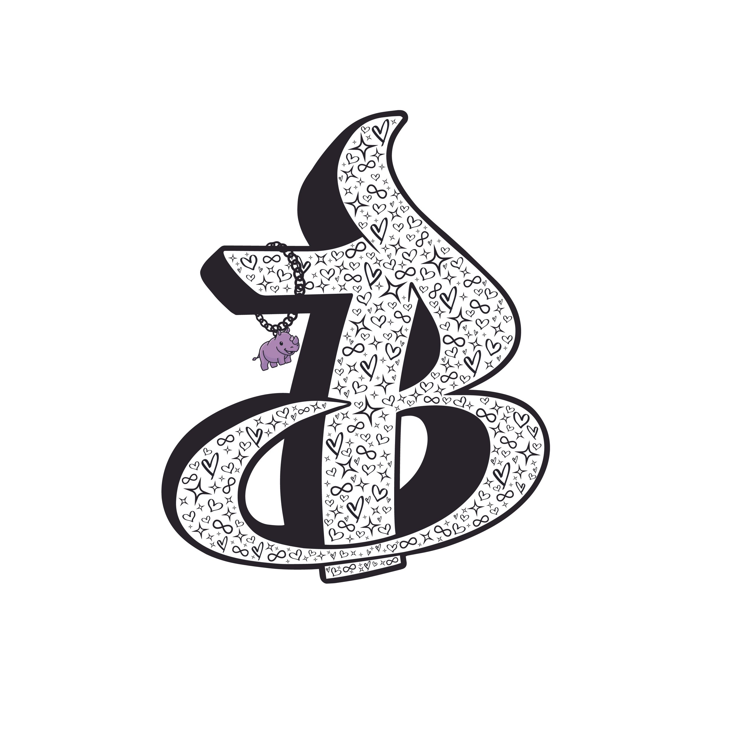
B’s Logo Design
Client:
B Otley
Design Brief:
B is a proud and vibrant non-binary person who runs LGBTQIA+ affirming events in Perth, WA. These events aim to promote awareness, inclusivity and belonging within the LGBTQIA+ community and are promoted via their social media channels and those of their partner venues.
B came to Sonder Design with clear set of elements they wanted to include in the design of their logo. These were:
A graffiti style ‘B’ that also resembles the number 13 (this is their favourite number and is significant to them)
Stars, hearts and the infinity symbol worked into the design
A baby, lavender rhino (this was requested as a final iteration after the main logo was developed and is a nod to historical LGBTQIA+ culture)
Design Outcome:
The final outcome incorporates each of the three important elements, while capturing B’s zest for life and individualism. Most importantly, B is thrilled with the design which “captures everything so perfectly”*. The logo has since enabled them to expand their ventures with greater influence and purpose.
*Their words!


